KLIENT
______
______
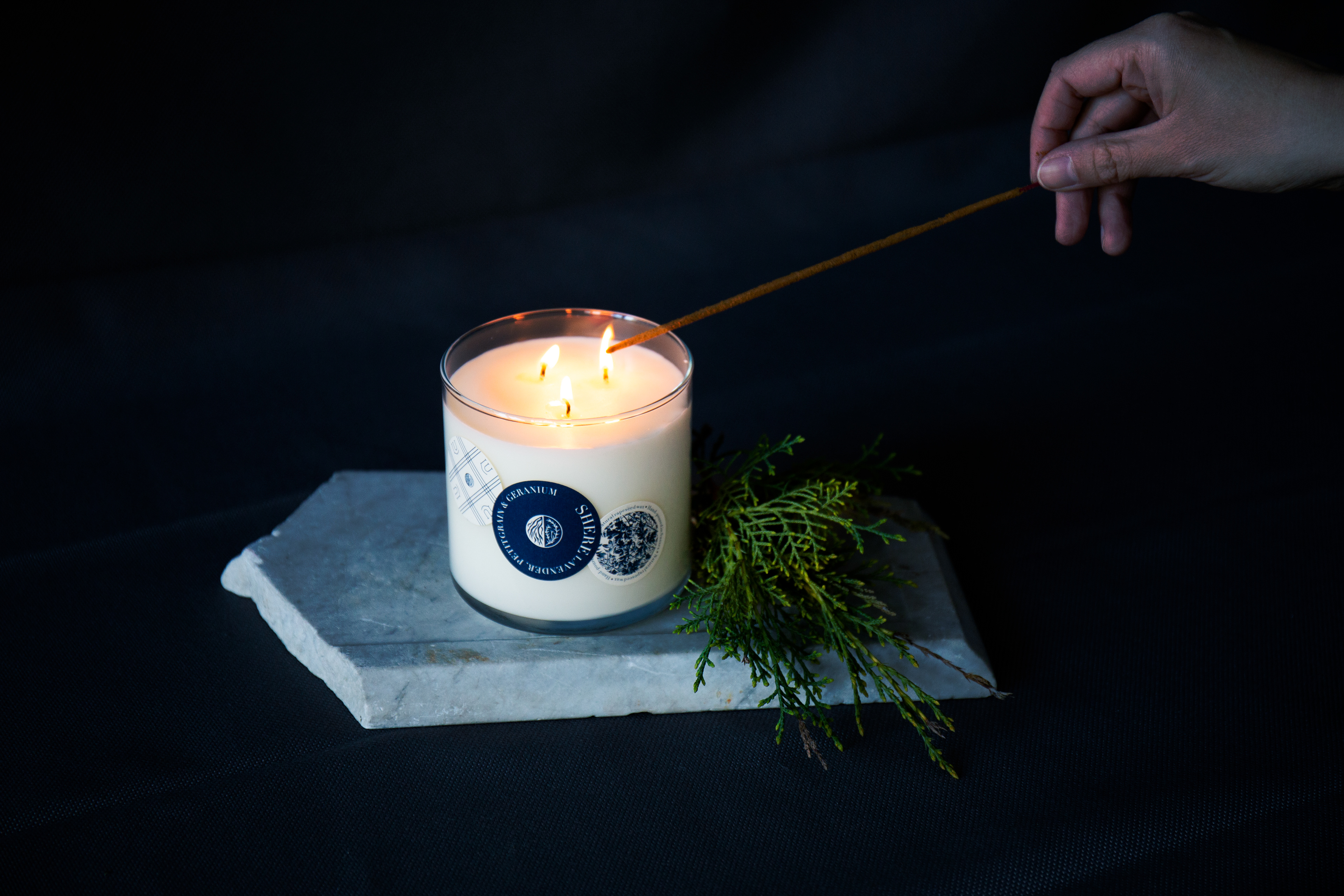
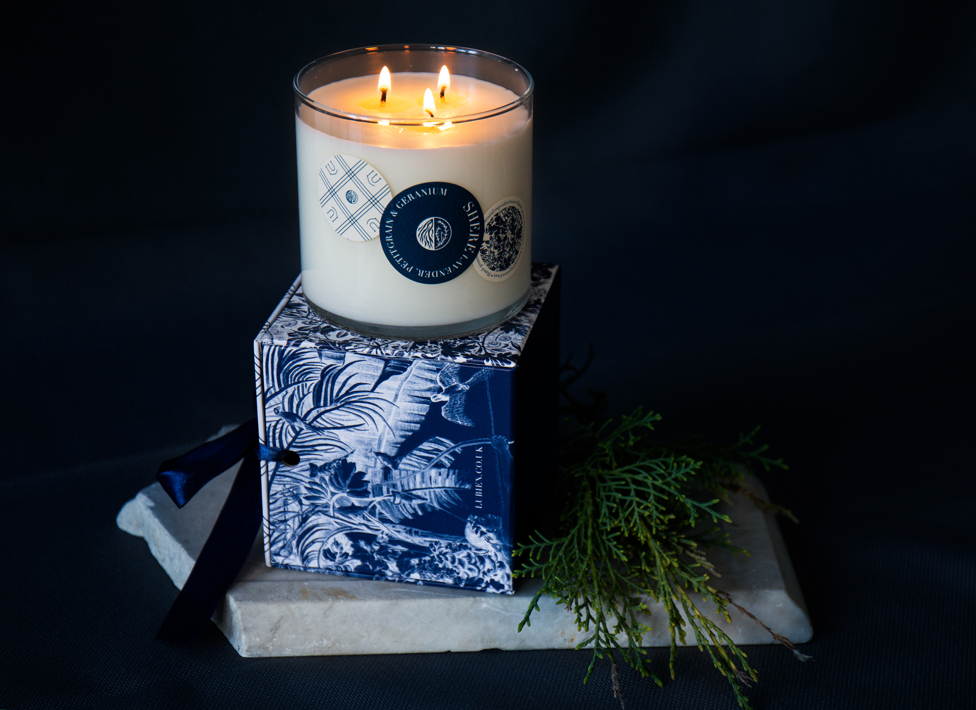
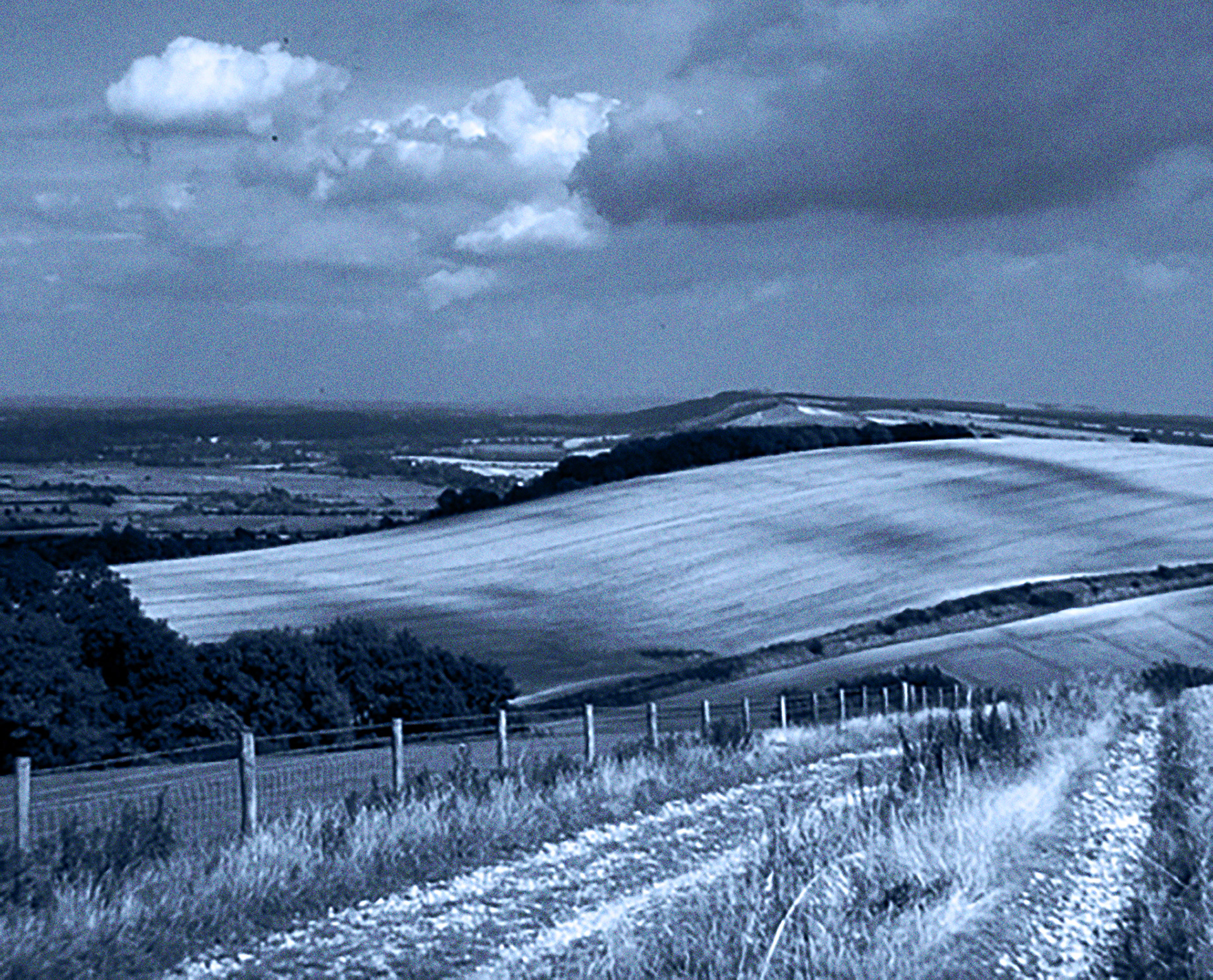
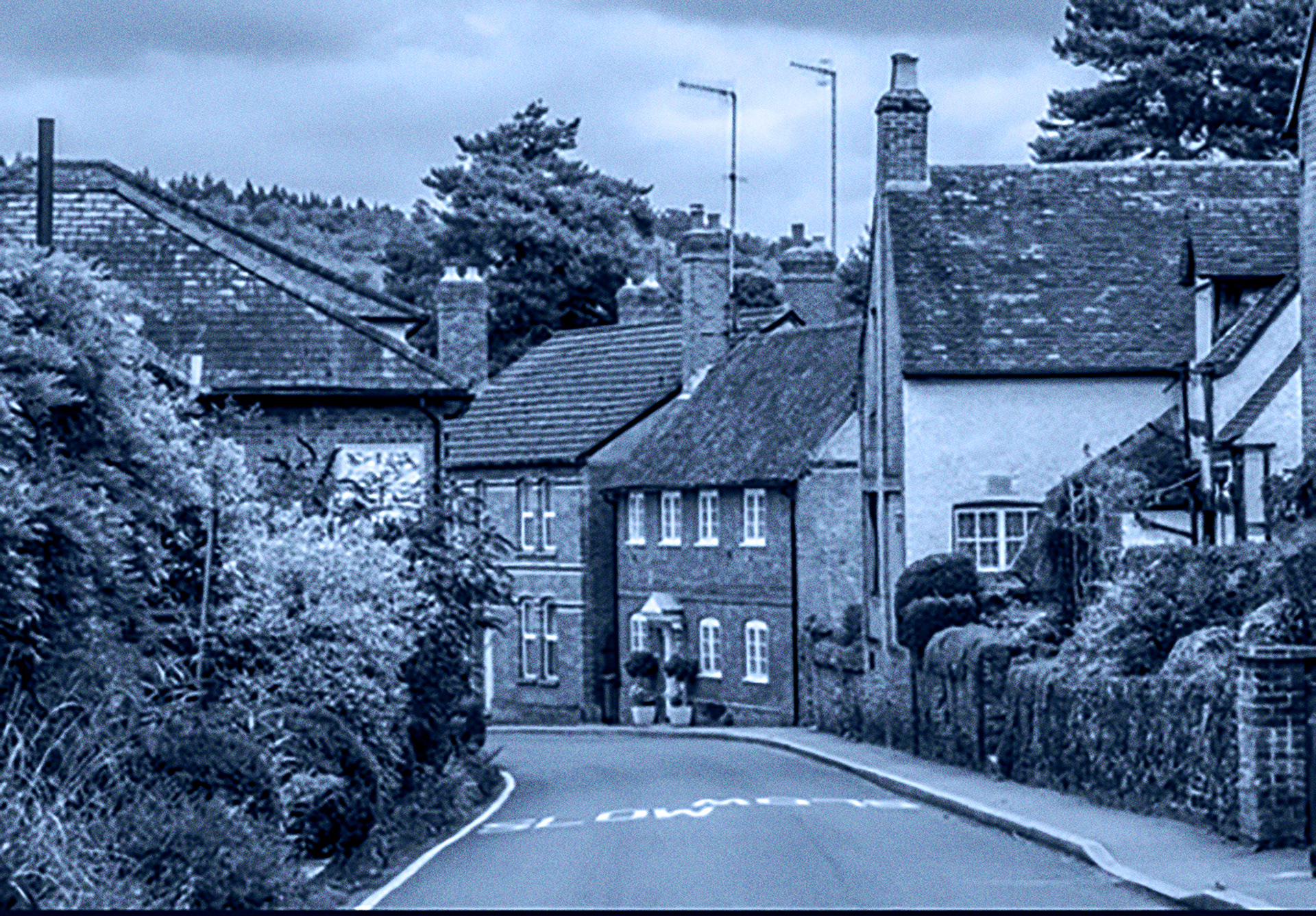
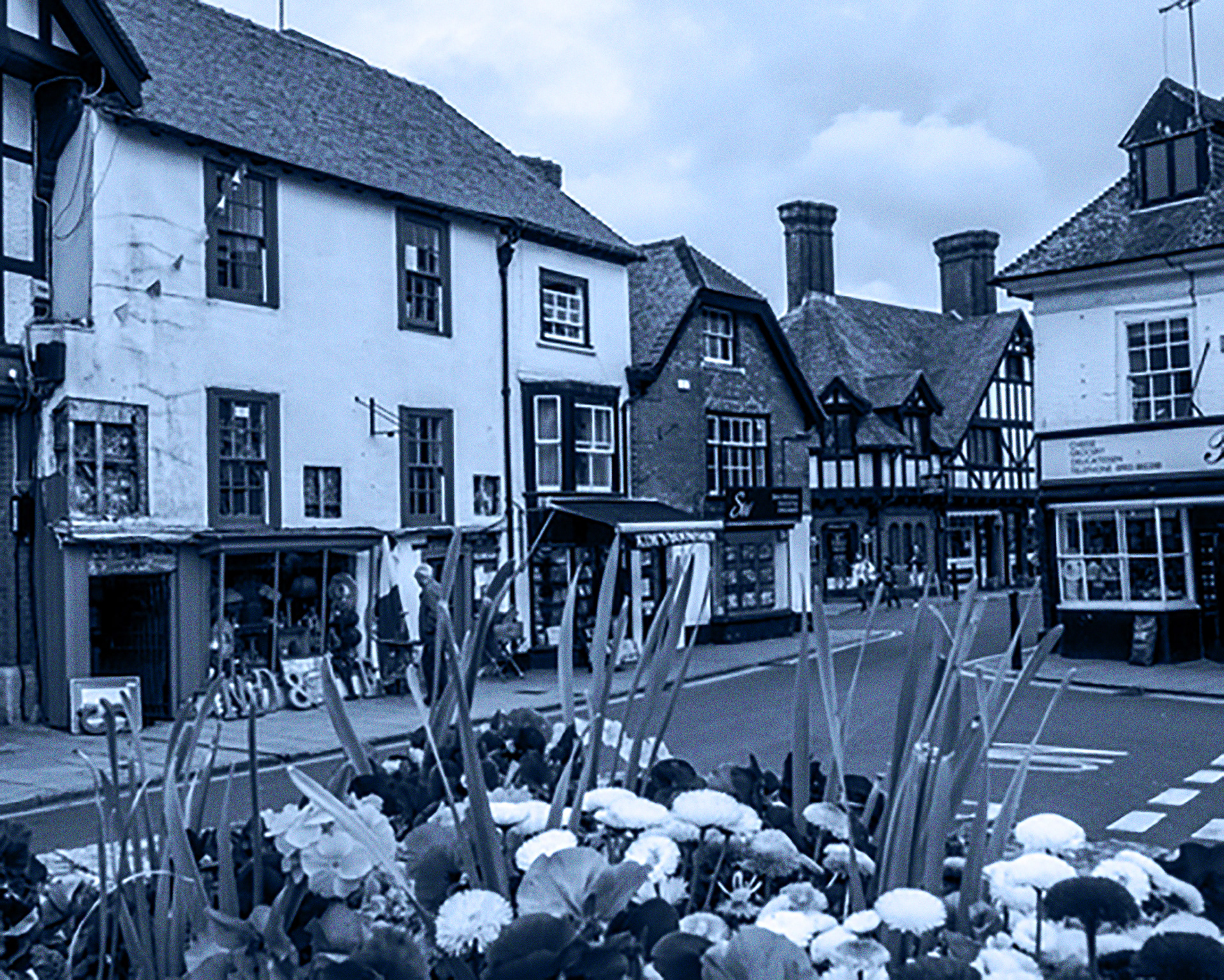
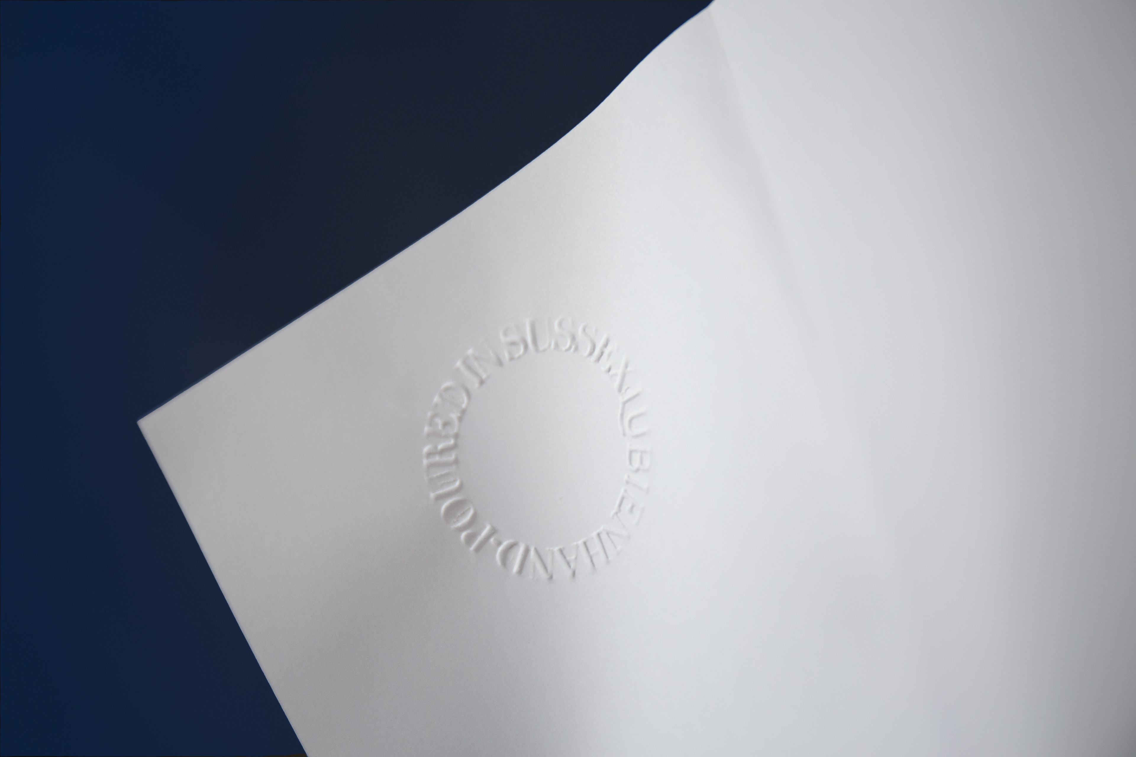
Lubień Candles produkuje świece, które zapachami przywołują klimat małych miasteczek i wiosek w angielskim Sussex. Świece wykonywane są ręcznie z największa dokładnością i starannością o składniki.
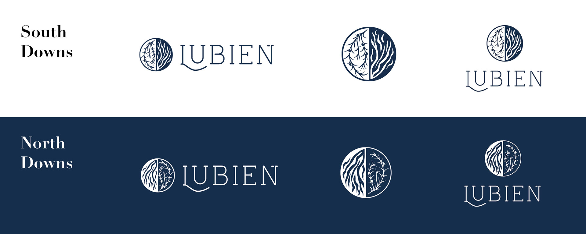
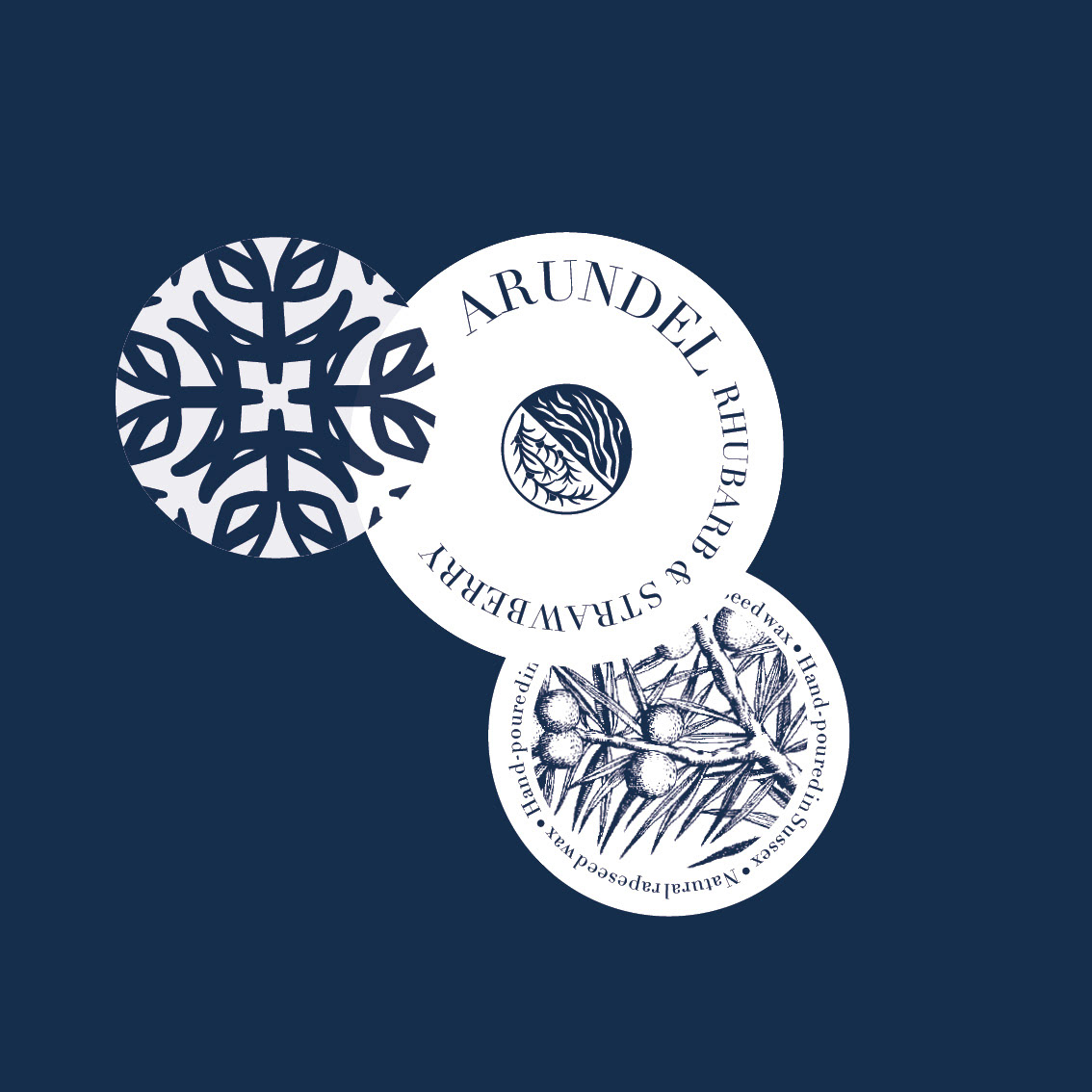
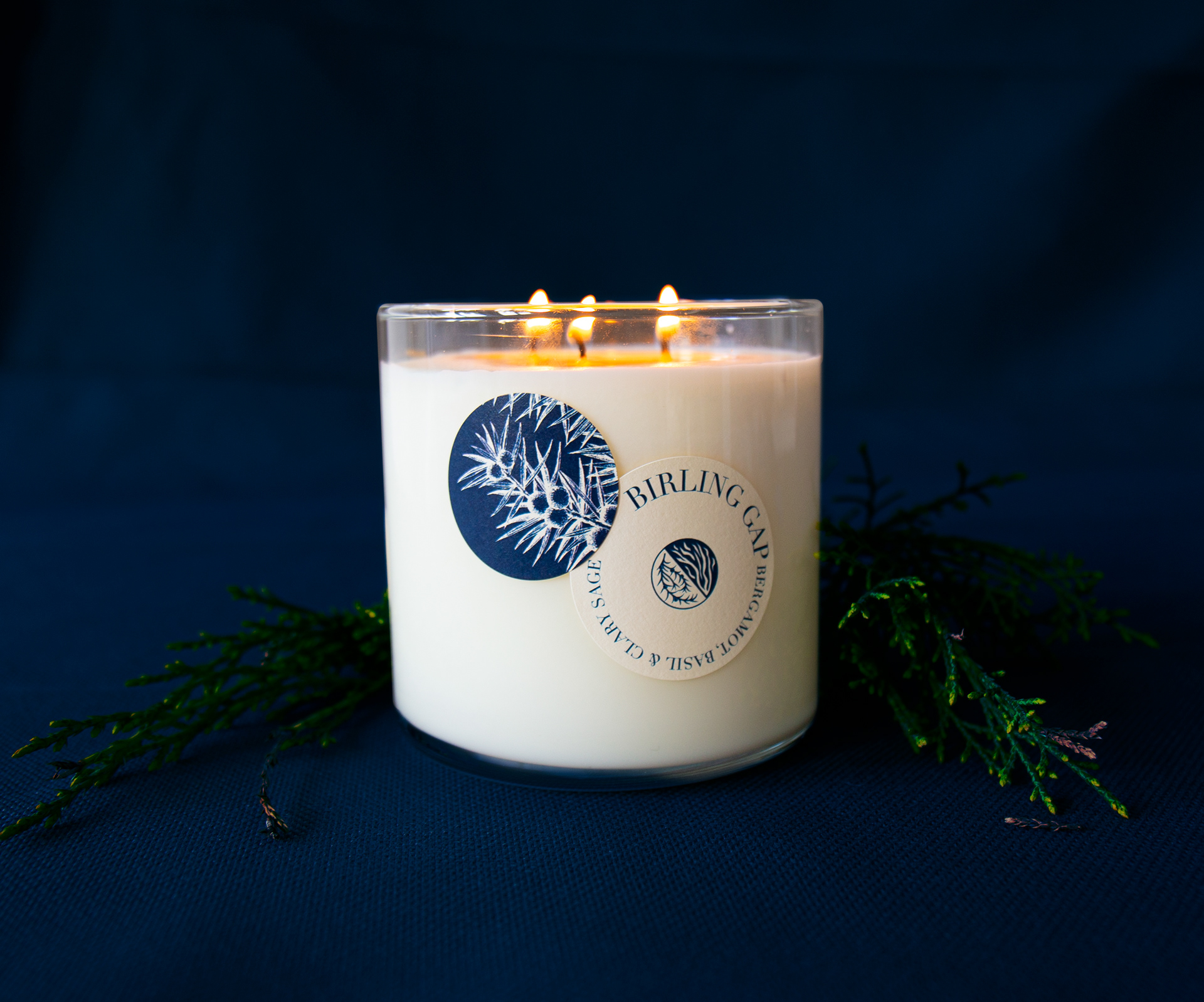
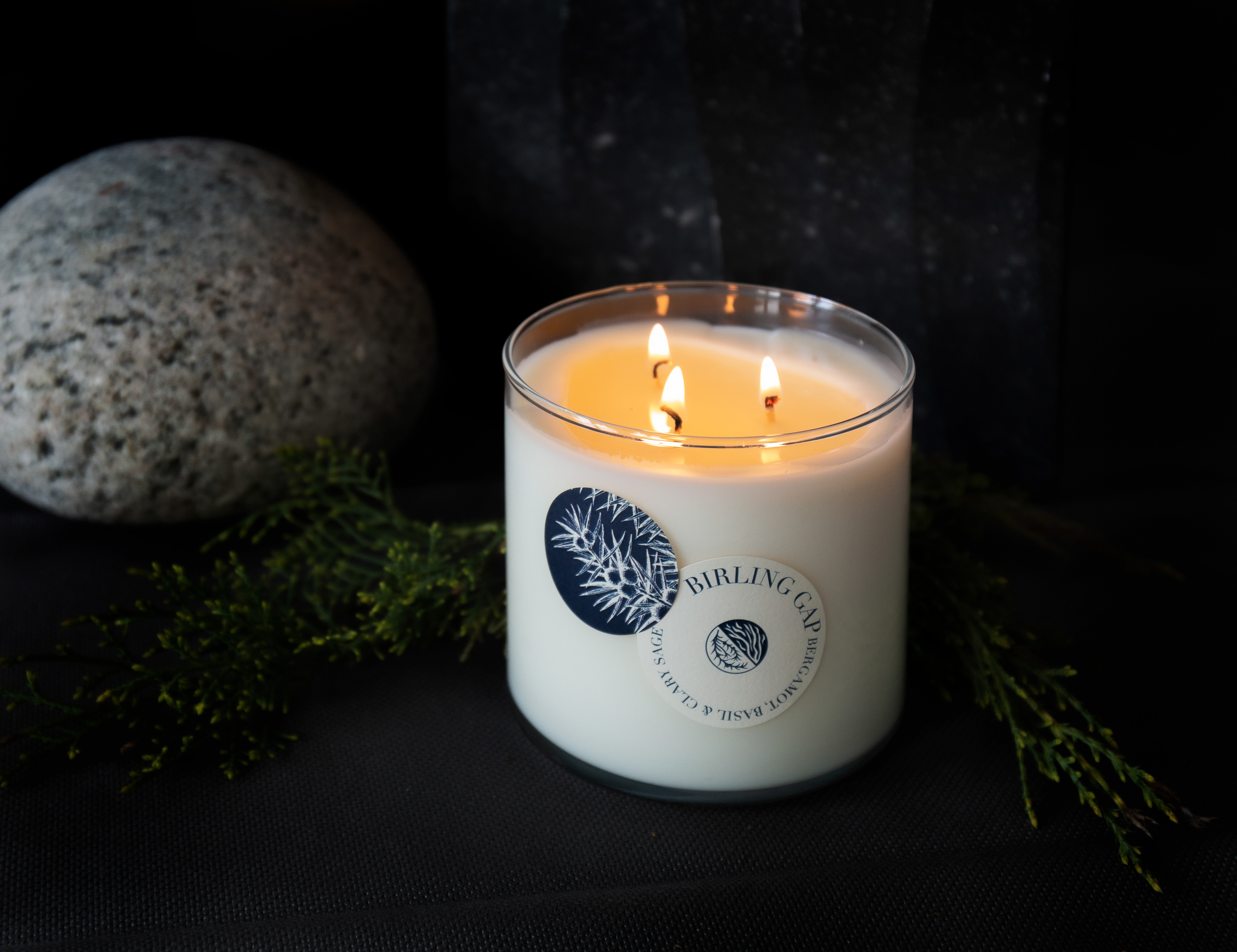
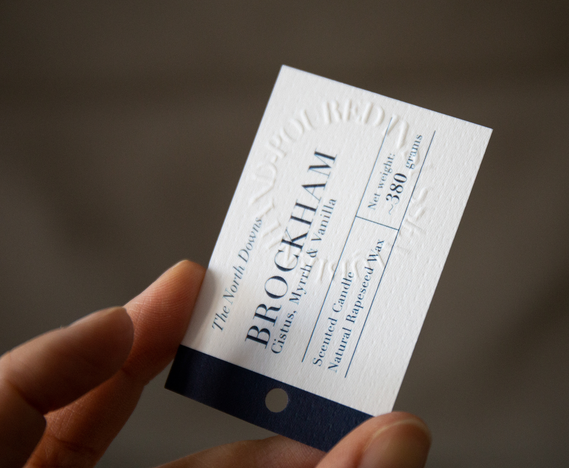
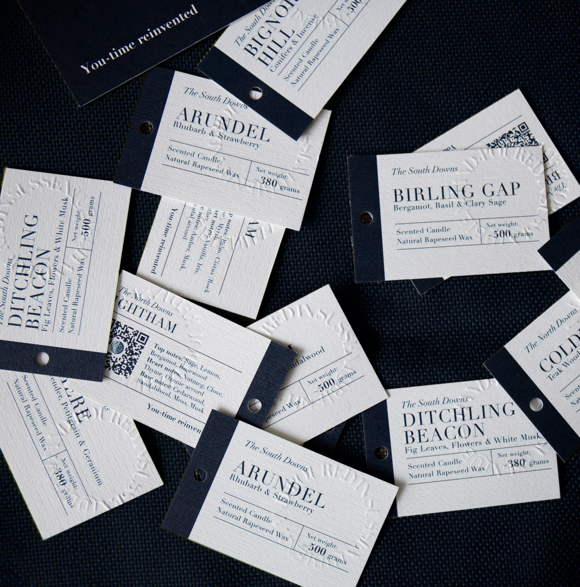
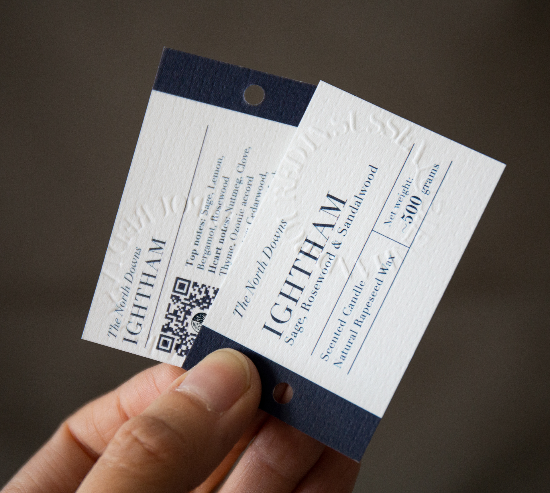
Zapachy dzielą się na linie: South Downs, z delikatnymi zapachami – dla nich stworzyliśmy białe etykiety i North Downs – cięższe nuty zapachowe i ciemne etykiety.
THE CLIENT
__________
__________
Lubień Candles produces candles with fragrances that bring to your mind the atmosphere of small towns and villages in Sussex, England. Candles are hand-made with the greatest precision and care for the ingredients.
There’re two lines of fragrances: South Downs with delicate notes - for them, we created white labels, and North Downs - heavier notes and dark labels.

ZADANIE
_______
_______
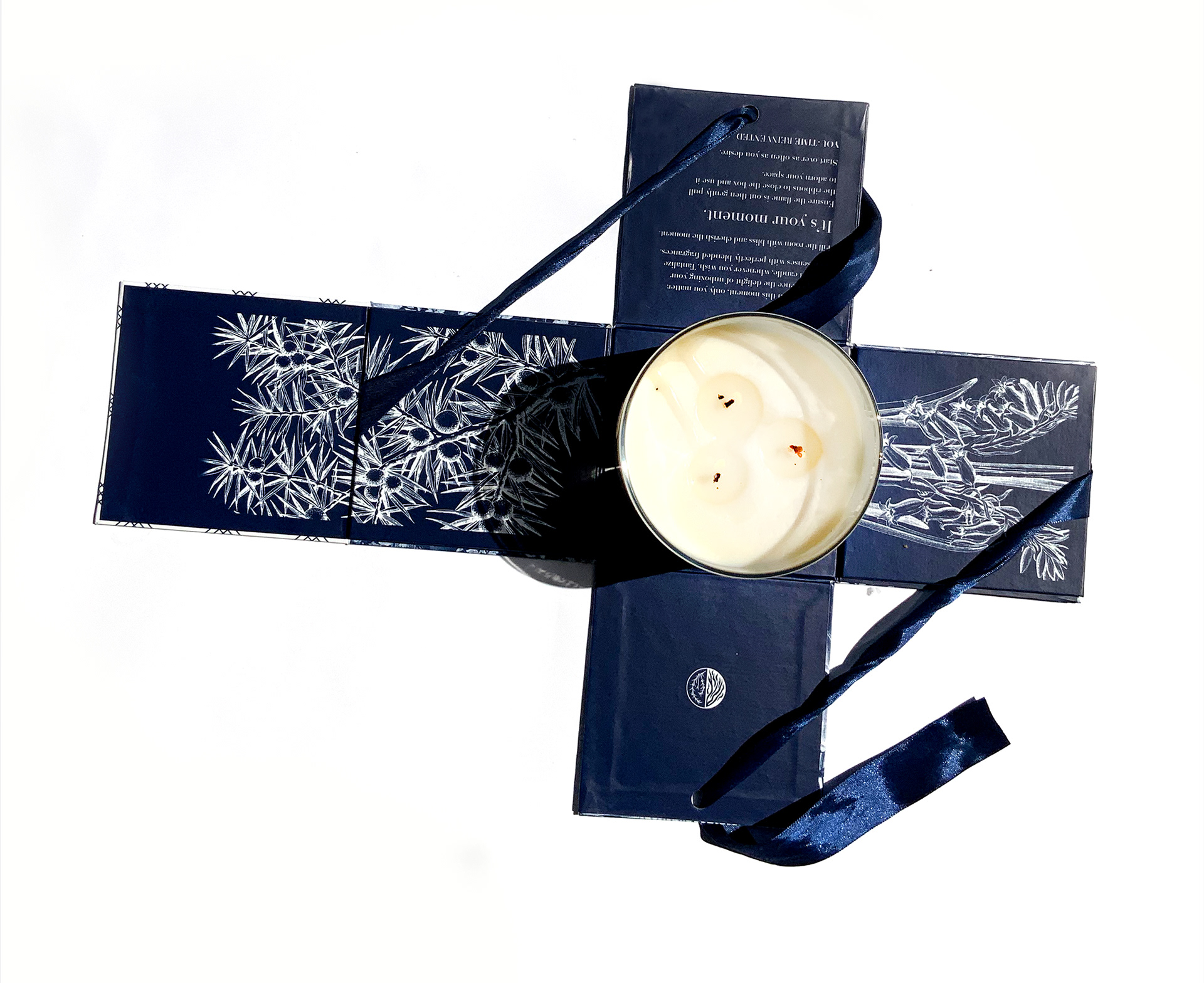
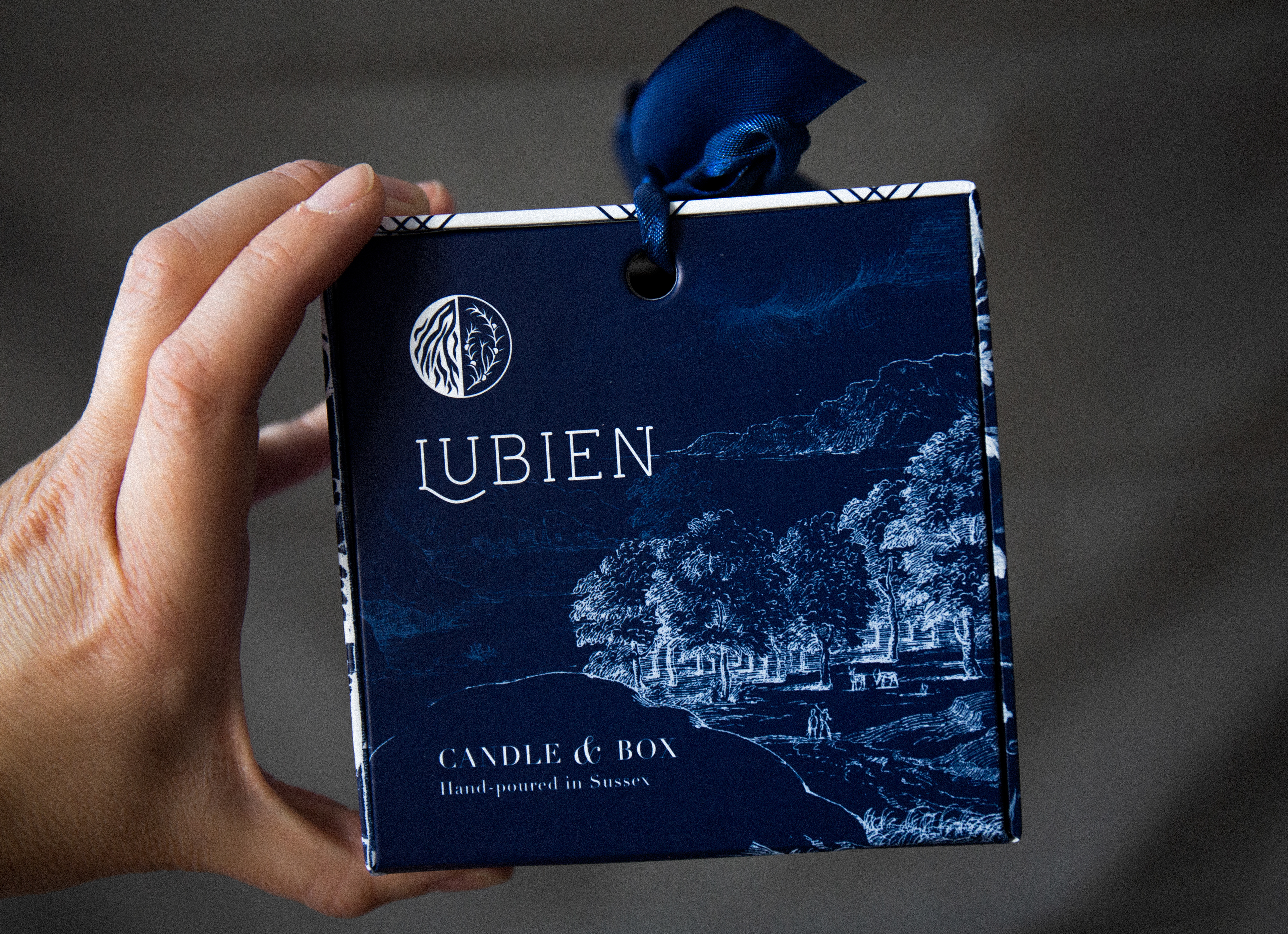
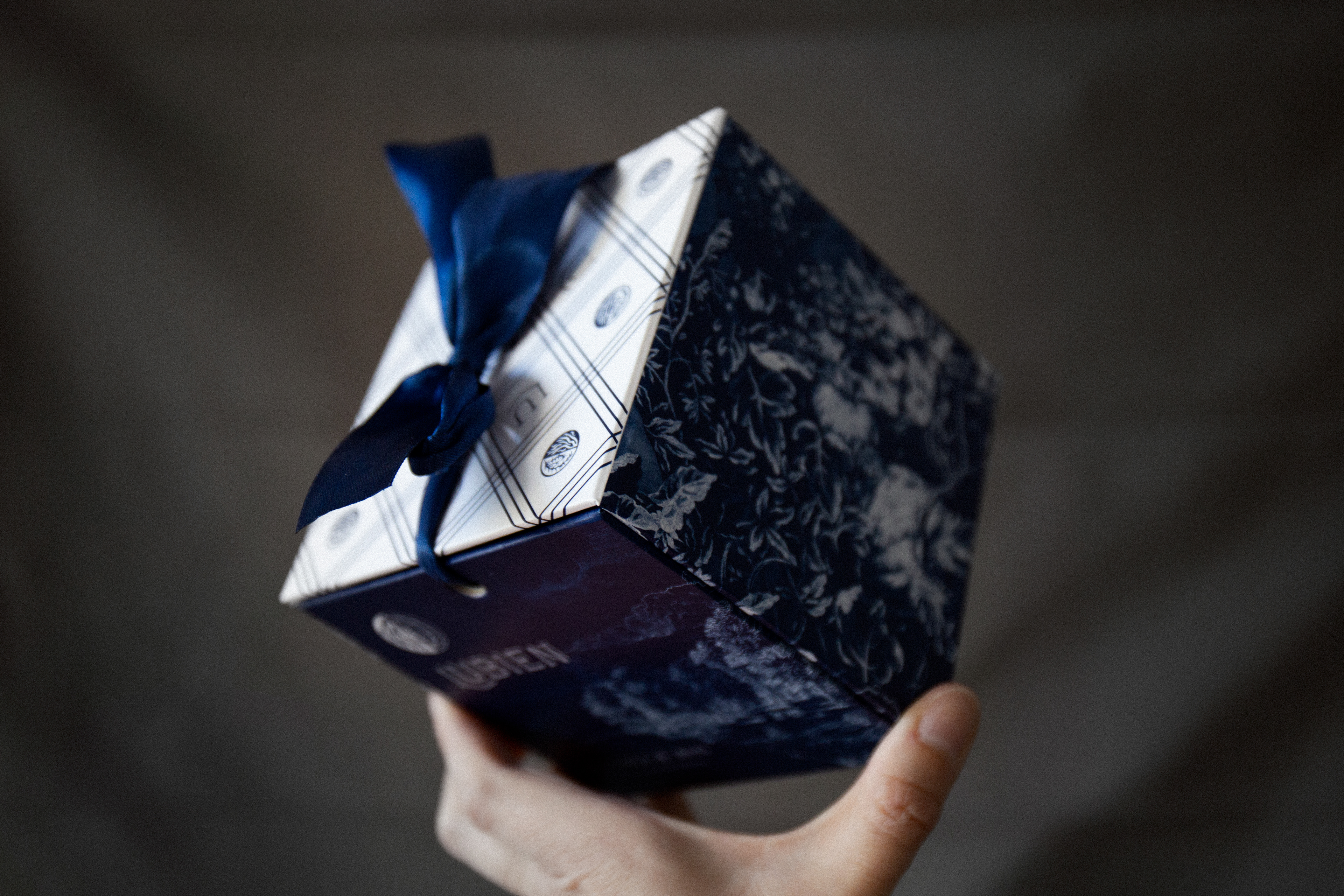
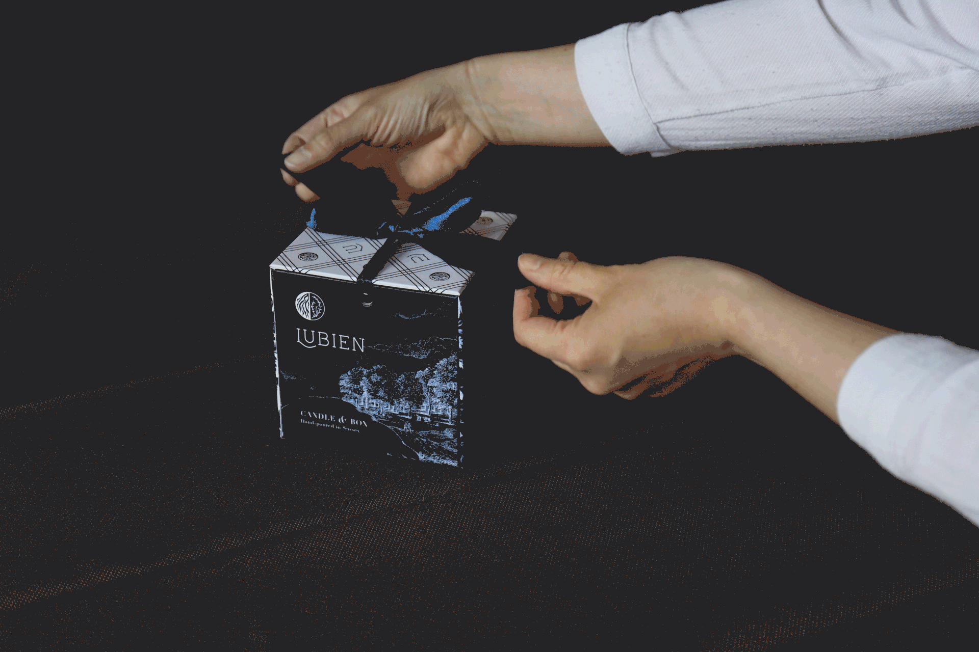
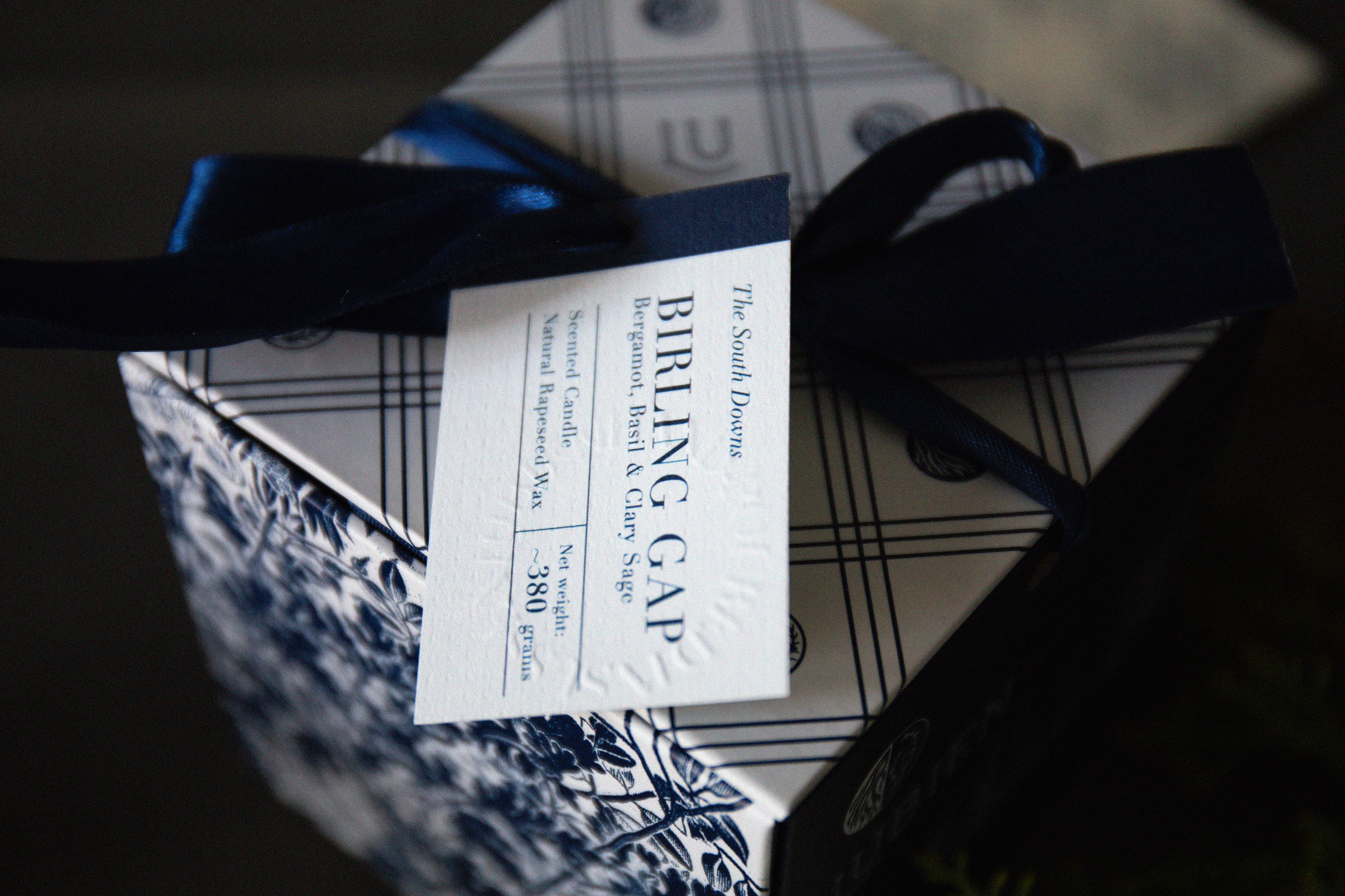
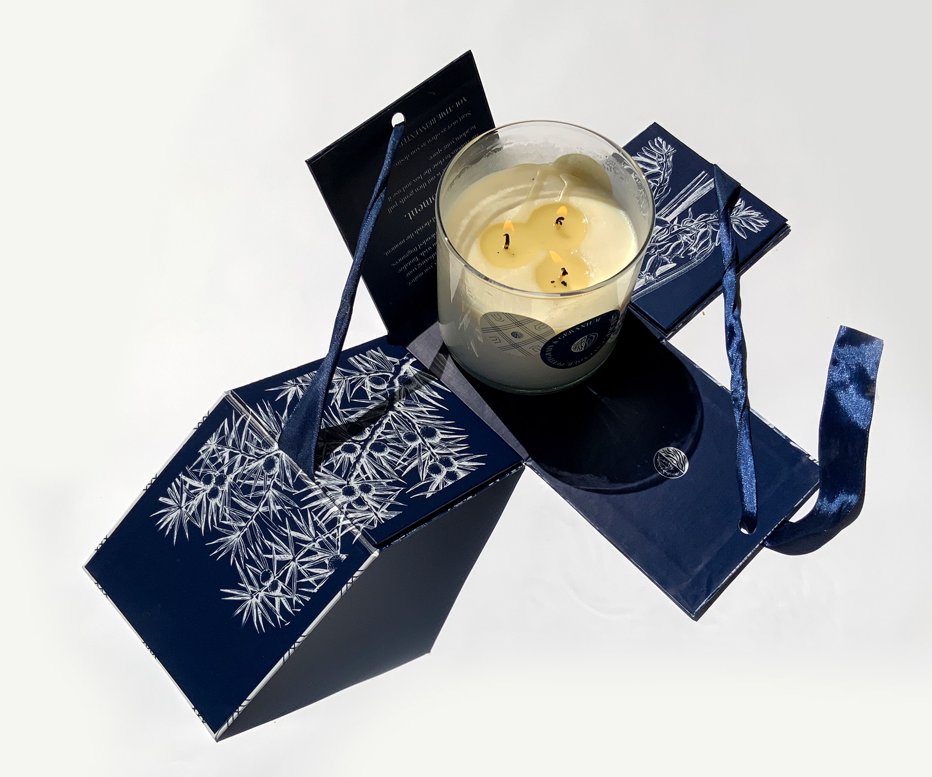
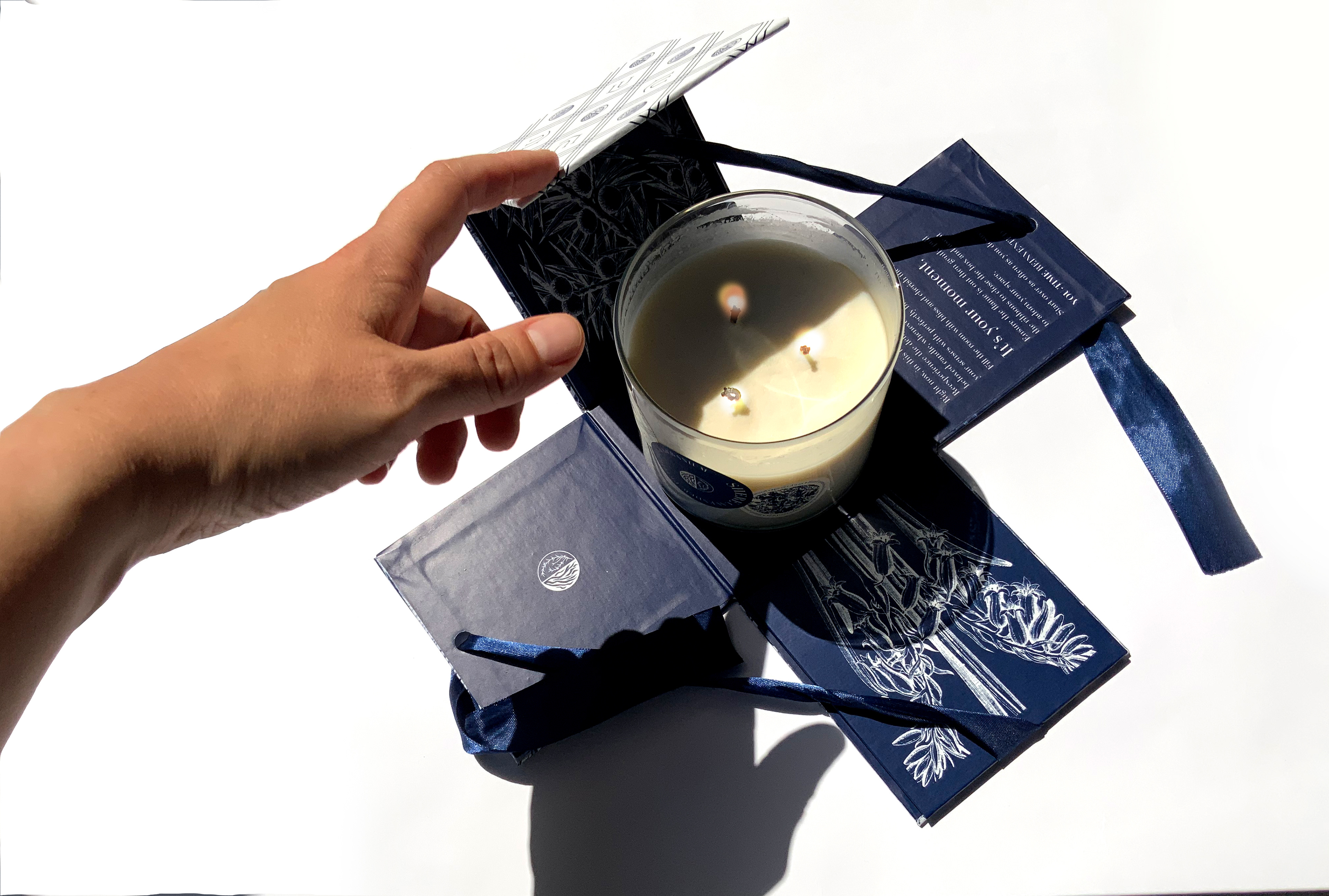
Identyfikacja miała być elegancka, wyjątkowa. Produkty miały za zadnie nie tylko pięknie pachnieć, ale też pięknie wyglądać. Klientowi zależało również na stworzeniu pudełka, które byłoby integralną częścią świecy. Miało się zamykać i otwierać za pomocą tasiemek, niczym w filmie Grand Budapest Hotel..
THE TASK
________
________
The branding was ment to be elegant and unique. The products were supposed to not only smell but also to look beautifully. The client’s original thought was to create a box that would accompany the candle and make a unique ‘candle and box’ set. It was supposed to close and open with ribbons, just like in a movie “The Grand Budapest Hotel”

EFEKT
_____
_____
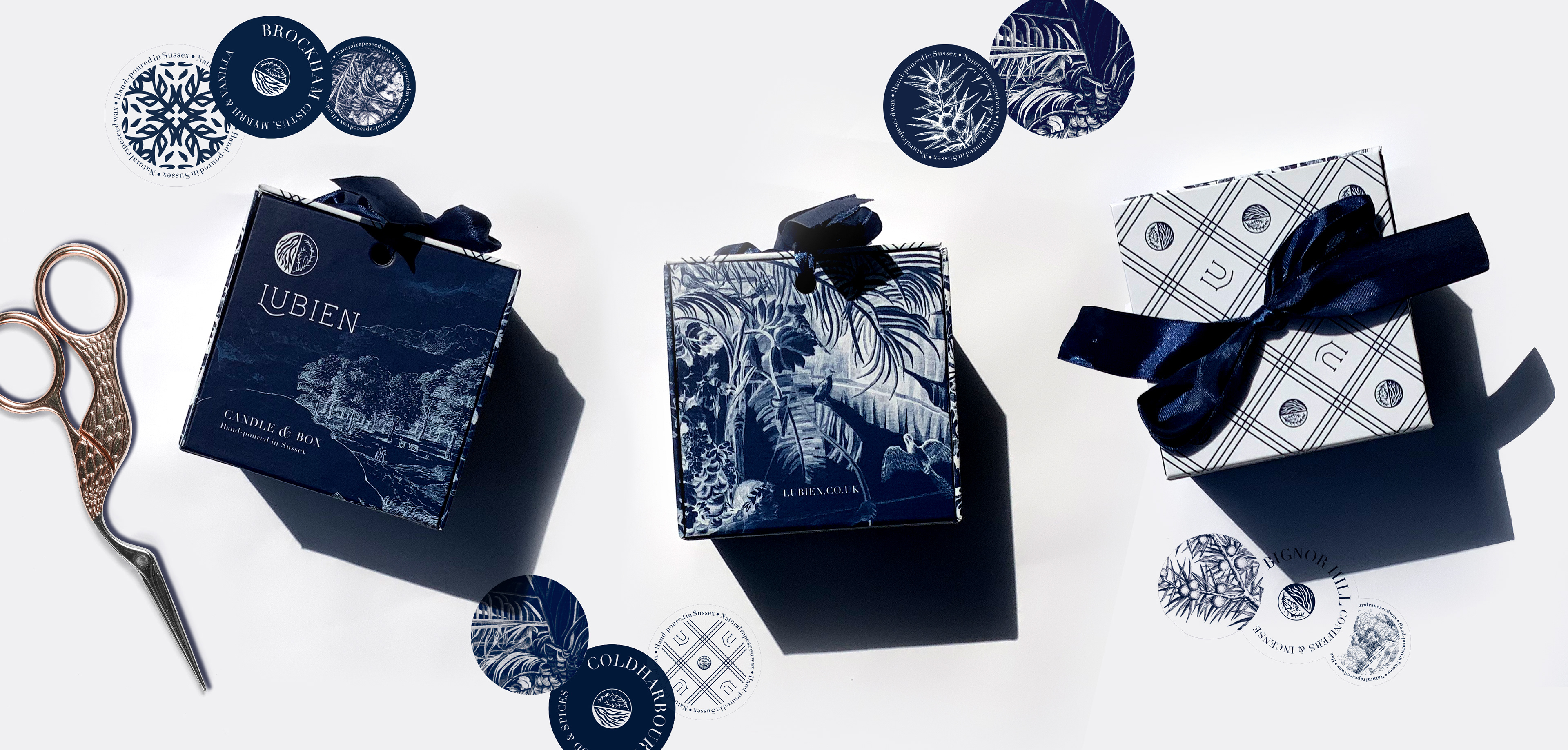
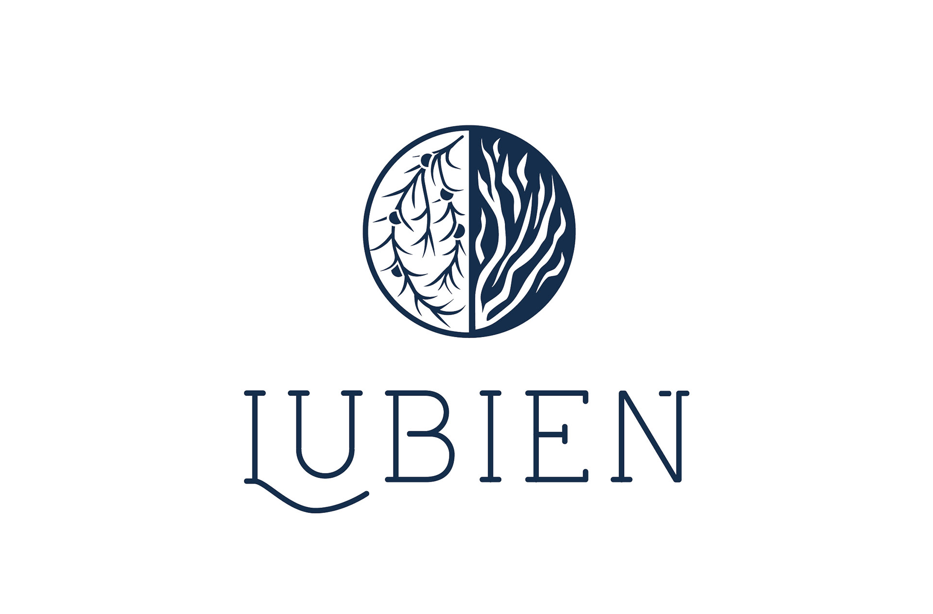
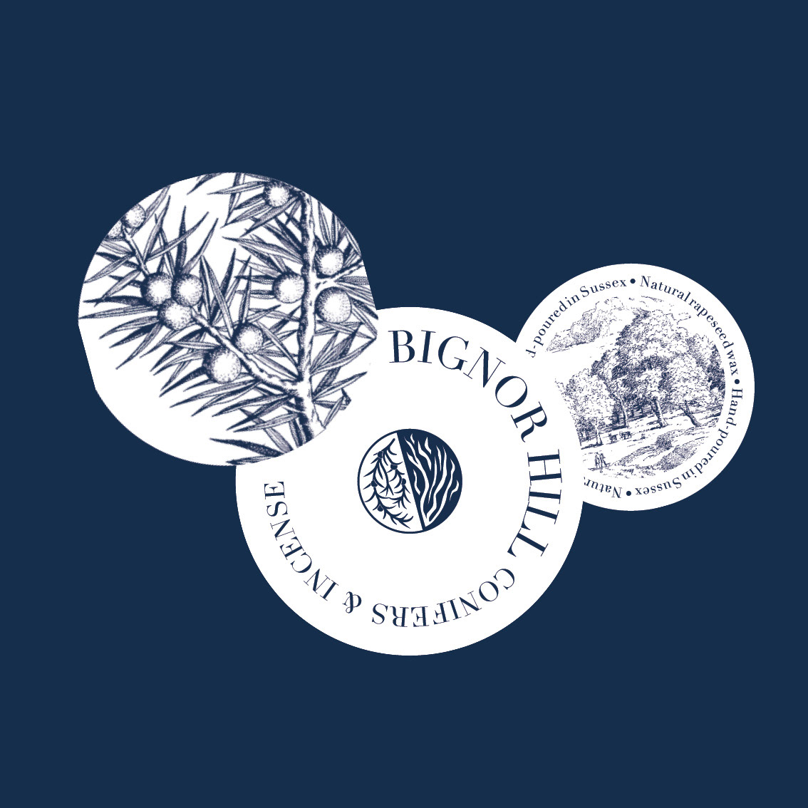
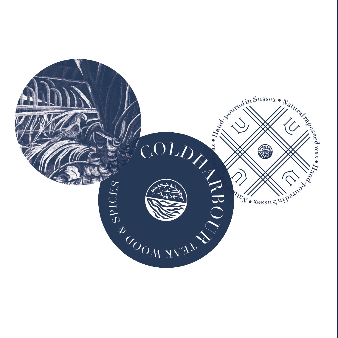
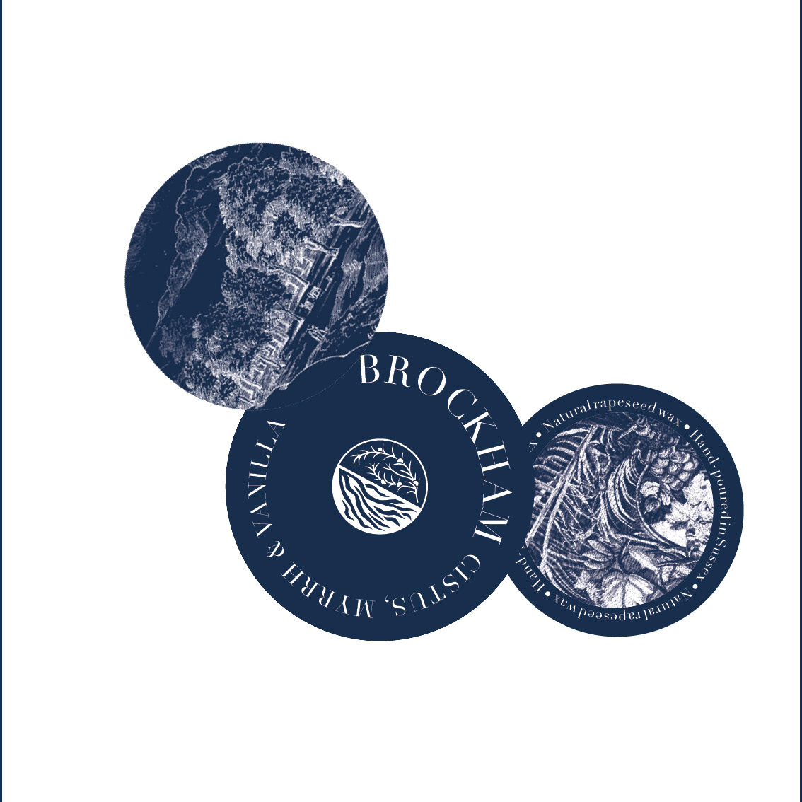
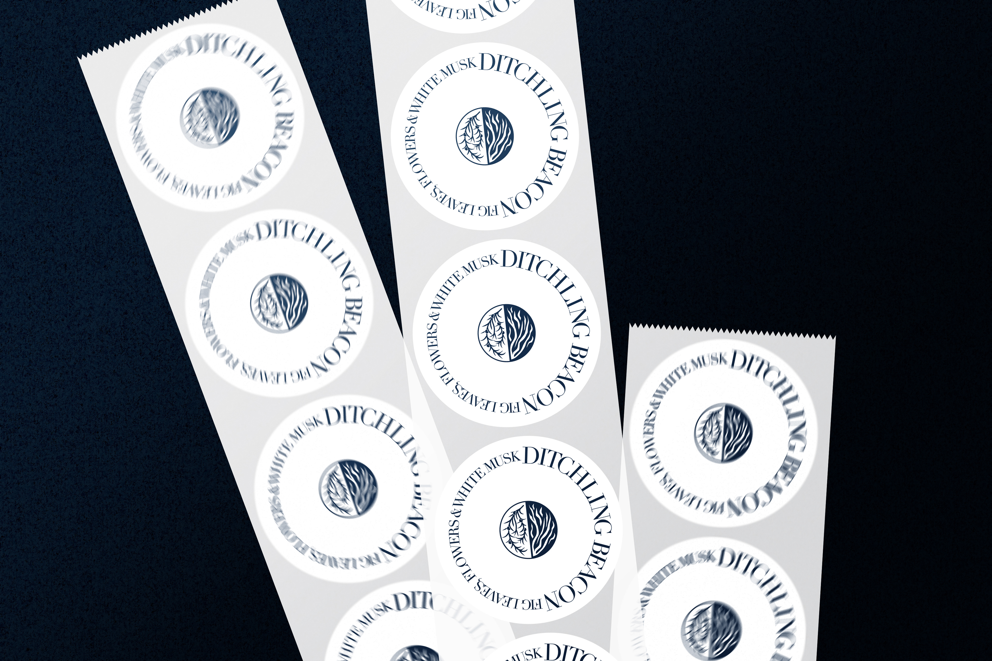
Logo dzieli się na pół, a każda połowa symbolizuje jedną linię zapachową – North lub South Downs. Aby dodatkowo podkreślić nuty zapachowe stworzyłam zestaw naklejek zamiast jednej, standardowej etykiety. Naklejki w abstrakcyjny sposób symbolizują różne składniki zapachów. Mogą być naklejane w dowolnej konfiguracji, co podkreśla różnorodność perfum i sprawia, że każda świeca wygląda inaczej.
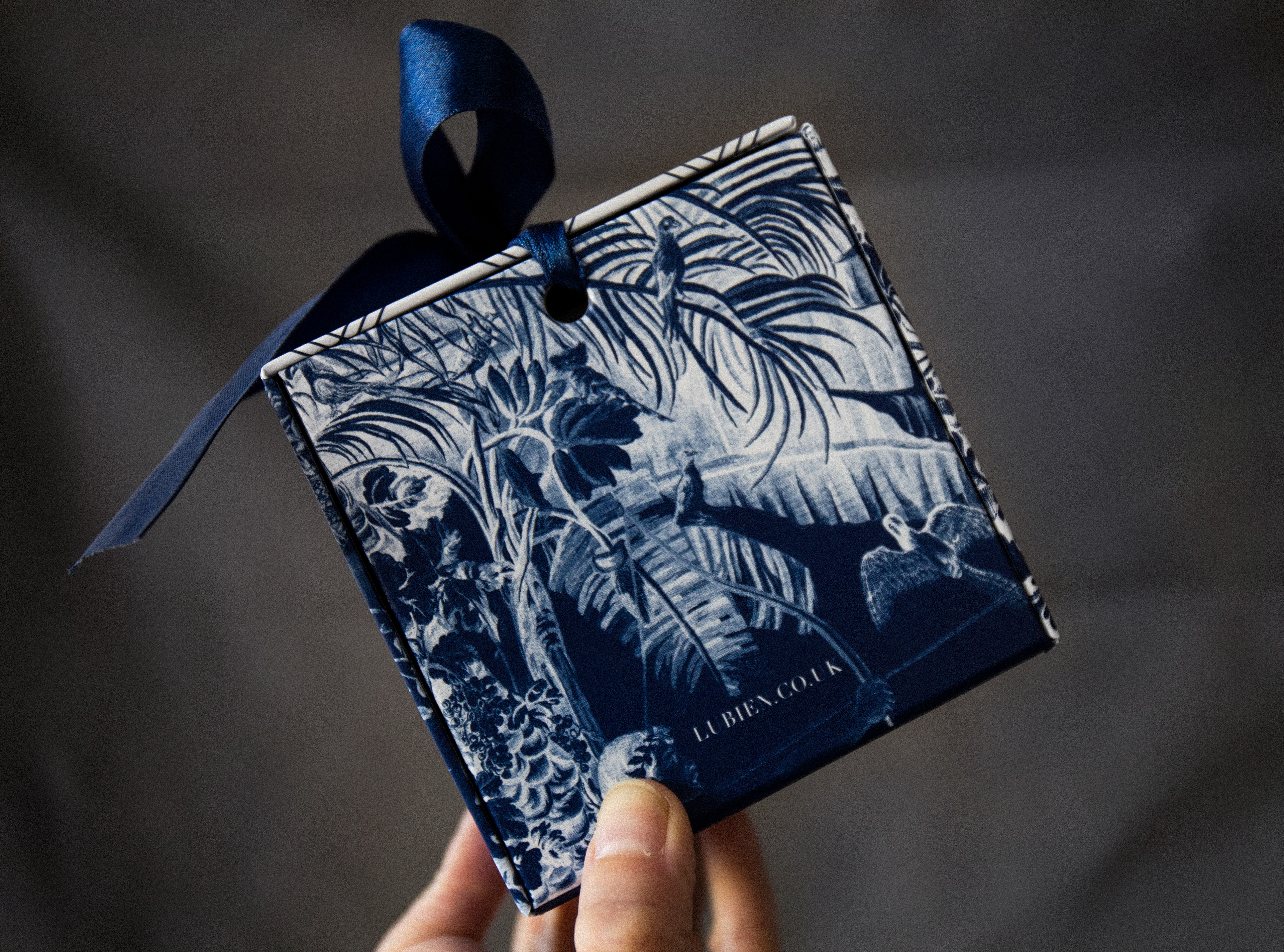
Udało nam się stworzyć piękne i funkcjonalne pudełko, które z zewnątrz, z każdej strony wygląda inaczej (aby lepiej prezentowało się na półce). Wnętrze pudełka jest granatowe, ciemne, aby lepiej wyeksponować jasną świecę.
THE SOLUTION
____________
____________
The logo is divided into two halves, and each symbolizes one fragrance line - North or South Downs.
To further emphasize the fragrance notes, instead of one standard label I created a set of stickers that in an abstract way symbolize the various components of the perfumes. They can be applied in any configuration, which again underlines the variety of scents and makes each candle look different from the rest.
We have managed to create a beautiful and functional box that looks different from each side (to make it look better on the shelf). The inside of the box is dark blue, in order to better highlight the white candle.
ZAKRES / SCOPE branding, logo, packaging
KLIENT / CLIENT Lubień Candles
ROK / YEAR 2021
KLIENT / CLIENT Lubień Candles
ROK / YEAR 2021